Character concepts 1 – Lain

I’ll probably end up posting quite a few of the character concepts I do on the site. I think it’s interesting to show, honestly I enjoy inventing new characters and scenarios more than drawing old ones over and over.

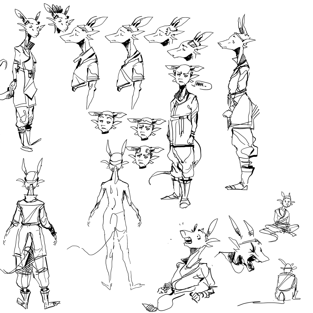
This is Lain, a character I’ve had since the very early stages of this comic back in 2010. Her basic design and personality has remained fairly unchanged since then, which is a far cry from most of the other characters that will appear in the comic. she’s around 17 or so. I’m looking forward to writing and drawing her cause I think her circumstances and personality will make for interesting stories. I don’t plan in detail too far ahead, I find it more fun to have some rough ideas of who she is and where her story goes and basically fill it in and wing it from there. planning too much makes it turn out really stale when I do it.

Main things I’m trying to figure out are minor cosmetic choices. Mainly the exact cut of her tunic, collar, and what kind of circlet she’s going to wear. I want something that doesn’t cover her eyebrows, I’m leaning towards either a thin band tiara kinda thing or a thicker band that goes around behind her head, over her frills, and doesn’t connect on the forehead. she’s come of age but is unmarried, and therefore doesn’t have the family crest facial tattoos like Sago or Jos, but has her own family mark on her tail or back or something. if she got married she would have the husband’s crest tattooed on her face as a symbol of the family unity, like Ausrea. If it was real, likely her current tattoo would be somewhere visible like her neck or arms, but in comic visibility I don’t think it looks all that great to have every single woman’s arm or neck tattooed and confusing the body language.

She started out pretty tall for a her gender, but I feel I’ve been steadily decreasing her height the more I sketch her. I don’t know, I kinda think it feels right if she’s just average or slightly below average. her slender build combined with her pretty long (and kinda goofy) frills and tendency to wear baggier clothes has a good look to it I think.

Stay tuned to see her coming up in the story!

Rene text

This comic is going to show a lot of different languages and accents. I never was too big a fan of the star trek-like tendency of making characters who are from very different regions speak the same language, especially in eras before mass communication or quick travel. back in ancient times it was common to develop extreme dialect differences even in fairly close areas just do to the difficulty of traveling to other regions. i want to try and show that here.

When a character speaks a language that’s foreign to the other characters, I’m generally going to leave it ‘untranslated’, and will avoid subtitles for the most part. generally the reader will be as in the dark as the characters are. i like this. it makes it seem more real. google translate didn’t exist in ancient times. it also kind of adds to the mystery and sense of wonder by experiencing different cultures, at least i hope.


the Rene text above is Gujarati script, a language and alphabet from western India. the font is courtesy of Google Noto, which is a pretty neat project that I would highly recommend checking out if you are also interested in different alphabets and languages. I wanted something foreign (to most americans) but still a believable-looking script. didn’t want something made-up like vulcan or whatever. I browsed through many different ones before deciding on Gujarati because it is pretty unknown in my region and looks very elegant while also simple. fitting for the Renes in the context of the story.

Different languages will be represented by different scripts, but I haven’t finalized most of them yet. I also need to figure out a way to convey accents of languages as well, which is a pretty interesting challenge. will try to avoid spelling out the words (ie texan: “‘ah love ya’ too”) so i’m coming up with other solutions. it’s annoying to read anyway and doesn’t really convey it the way i want.

cal

Malwan, facial recognition, and tattoos

Hey all. just wanted to share a couple of things.


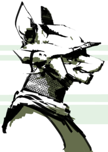
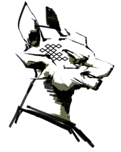
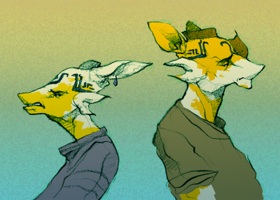
This is the character Malwan that was introduced a few pages ago. He is a city guard, and I imagine is in his late 30s or so. He just has the kind of face that looks like he’s constantly ticked off, but he really isn’t.

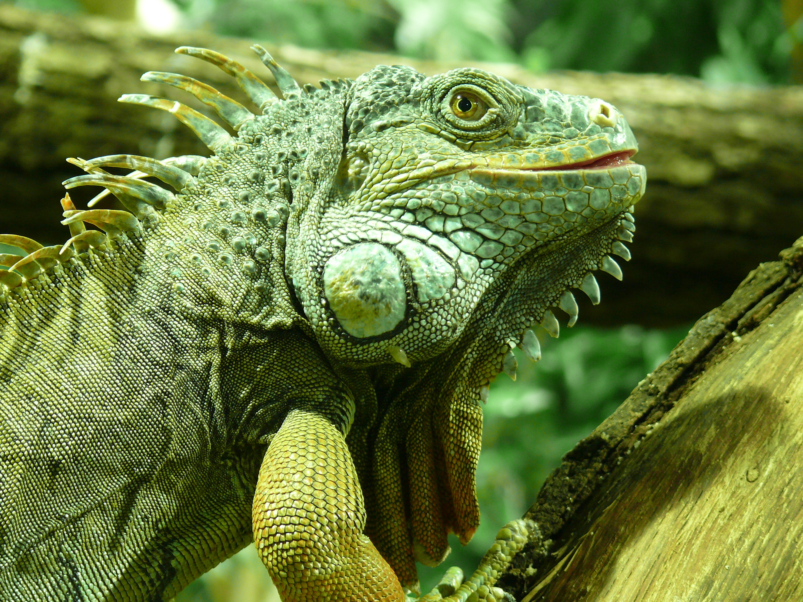
When I started solidifying ideas with this comic, I ran into some issues with the character design, which I’ll go more in depth at a later date. However, one of the main problems I kept coming across was how difficult it could be for the casual reader to tell certain characters apart. I find that usually the more alien a character looks, the harder it is to not only relate to them, but it is to tell different members apart. The human brain is incredible at recognizing humans, and we practice at it every day. But, say, try to tell the difference between two iguanas.


(credit to the owners for the photographs)

From a logical standpoint, they have just as many differences in their faces as humans do. The second has a much larger jaw, shorter snout, and protruding lower lip compared to the first. It would be easy to recognize a human with these features compared to one without. But from a ‘human’ standpoint, there’s just something alien about these iguanas. Try to pick one of them out from a crowd of iguanas. I doubt anyone could.  Unfortunately this is also a problem with the species for this story, and one I see many people with non-human characters run into as well.

There are several solutions I can think of. Color is easy to do. Bill and Bob are both crocodiles, but Bill is orange and Bob is purple. Simple. Unfortunately, color also takes much longer than B+W, and I just don’t feel like at this moment in time I have the resources to do it.

Specific clothing to a character also helps a lot, helping the reader to associate a color or pattern or a clothing design to a character instead of a face. Unfortunately, without color this is much more limited.

Stylizing or exaggerating features of a non-human character can help, but I find only if you do this to an extreme degree. For this comic, I’d rather not.

What is my solution? Tattoos.

In Song of the Motherland, characters in many of the countries show their family lineage by tattoos on their faces (occasionally, arms or tails). It’s basically like having an ever-present coat of arms. Every family’s mark is unique in designs and colors. Men and women get theirs when they come of age, with men receiving theirs on their face, and women on… anywhere but their face. Later on if they get married, they will get their husband’s mark on their face as well, a symbol of uniting the two families.

I admit this solution may be a bit cheap, but I think it also provides some interesting opportunities to explore cultural depth and stuff. It may not help tell apart a character in a crowd, but between only two people talking or whatever it might just be the push that is needed to help the reader. That being said, I still try to make faces as unique as I can get away with, but this is more for the reader’s convenience than my own.

cal