got pretty hung up on stylized comets and planets with rings on this one.

when doing comic concept I always try to do most of it in B&W. I didn’t used to but I learned my lesson. things always manage to look different in color.
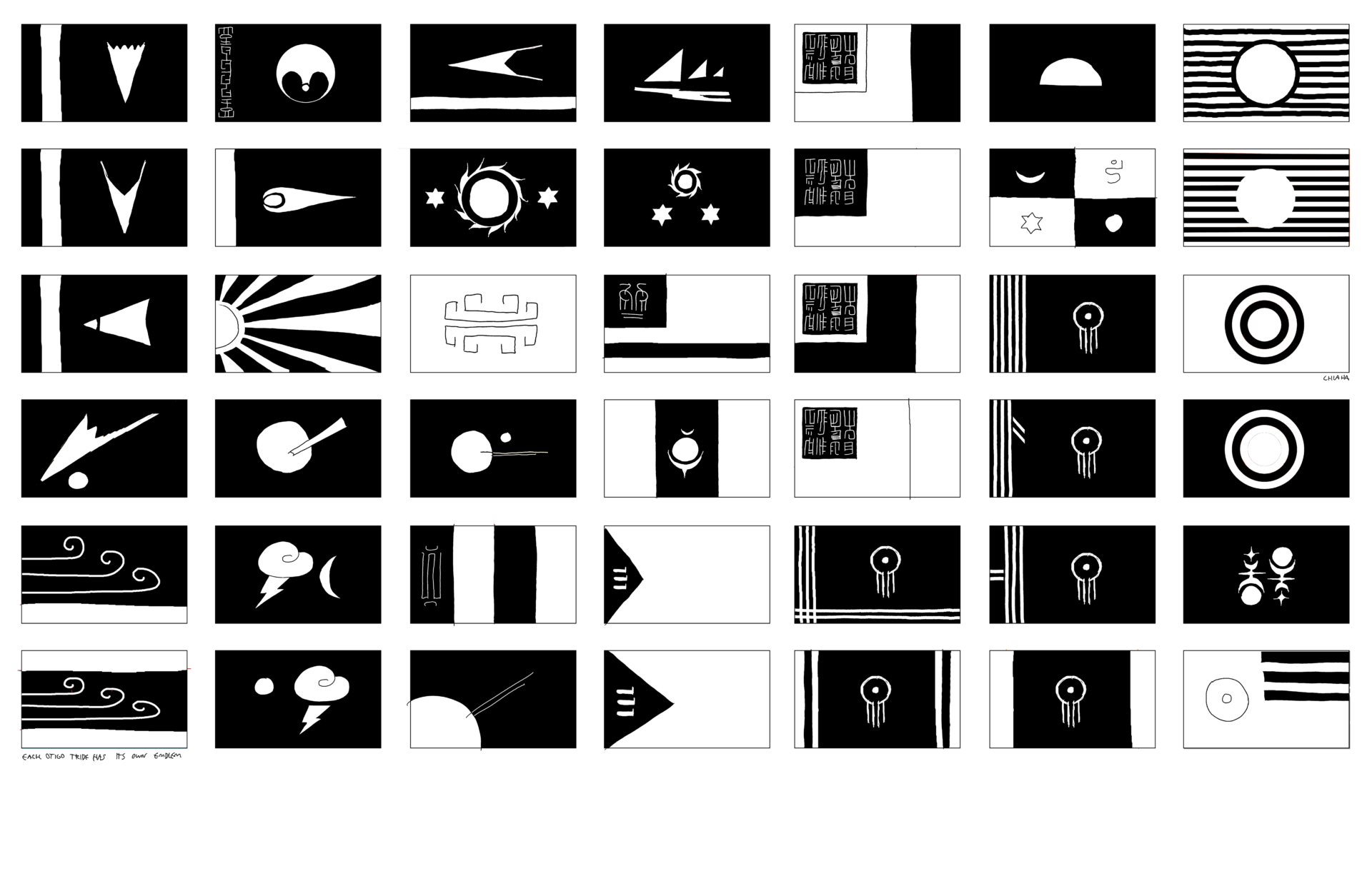
I really like this batch overall. just some tweaks here and there. i think most of them would be fairly striking even in B&W. I found the Good Flag, Bad Flag pamphlet to be a good resource. it breaks down flag design and why things work and other things don’t in an understandable way to the layman. i am by no means an expert on flags, but hopefully i have enough design experience to make something striking and poignant (or at least recognize when a design isn’t).
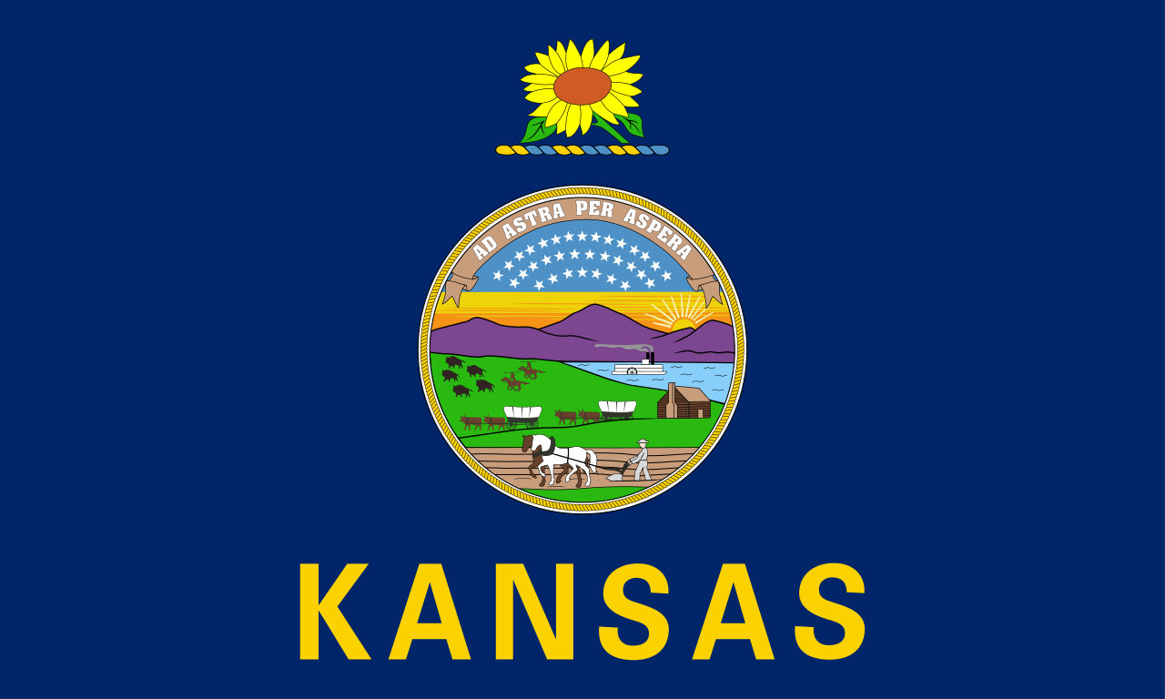
on a side note, i wish my state flag (Kansas) could be one of these. or something like it. or just something that isn’t the flag we have at the moment. it’s just so bad. along with the like 20 other state flags that look just like it. none of them stand out, and you can’t even see what’s on the seal at a distance. in my opinion many badly need a redesign.
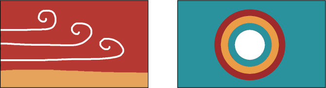
with these two designs at least they would be fitting for kansas with kansas-y colors (sunset, sky, fields, clouds). simple and distinct. the mostly unknown state banner is fine too, we could always use that. a man can dream I suppose.