Nations and shape language

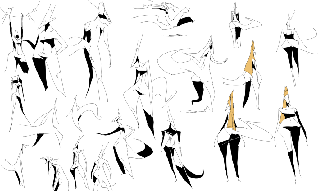
been working on this for a while now. Since there are a variety of people groups and nations in the story, I am doing my best to work on making each nation have shapes (roughly) specific to them. not last airbender level or anything where “this country only wears red clothes”, but still. it’s a hard balance to keep in mind. at the very least, distinct clothing and silhouette elements that represent one nation I’ve been trying to keep separate from other nations.

Up to this point the comic has only covered a single nation, Allano. In hindsight, I probably should have limited the variety of their clothing, but you live and learn. That said, I am consolidating the core ‘essence’ of what the allanos wear and trying to differentiate it with the other groups. i’ve dabbled with the designs of other nations here and there but the past little bit I’ve really been trying to make a concerted effort to make things decently distinct.

In real life of course there is a lot of trends that carry on over the border, but sometimes it is necessary to limit that just so the audience can tell where the heck this character is supposed to be from. at the end of the day it is a loose guide and I won’t lose too much sleep if it isn’t an airtight system.
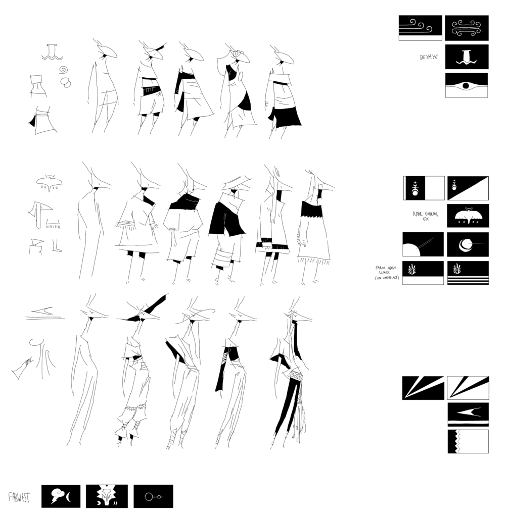
my main strategy is using designs I like the best on places where I will spend the most time and filling out the rest from there. everything is heavily subject to change as always. I choose to hold off on giving away too many details to avoid spoiling anything interesting later 😉

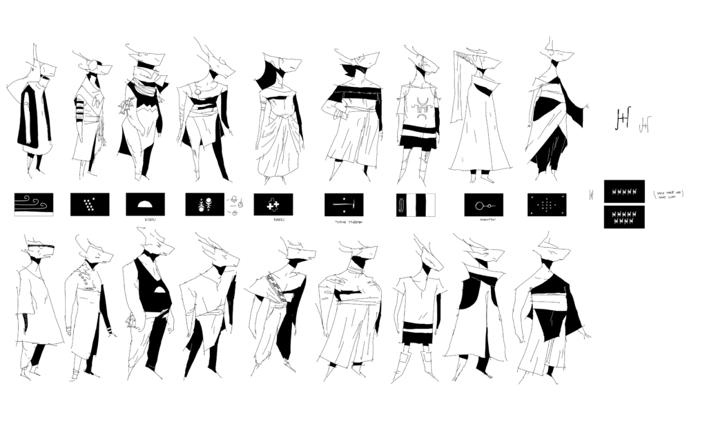
Otigo Trappings

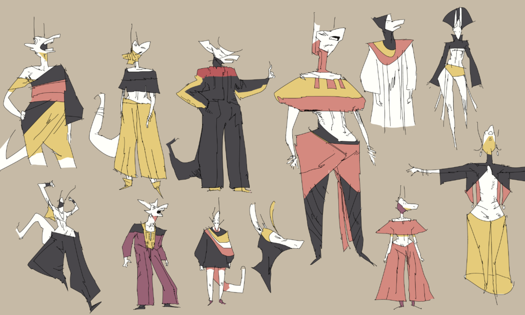
as always, playing with things to see what i like and what i don’t. in real life people wouldn’t dress like they do in the fire nation (“we all have to wear red!”), but it definitely helps the reader. you have to be a little heavy handed sometimes to drive a point home.

these are some ideas i have for the Otigo people. at this point they will not be the main focus but will impact other nations in the area through their actions and culture. they are a loose group of many disparate tribes and i was dabbling with how to make the body shapes and outfits distinct but not too different (they are all part of one people group). at this point i’m leaning towards reducing the diversity even though I like most of the outfits in a vacuum. ideally i want the reader to be able to fairly easily recognize any of these characters as from the otigo area. for that purpose they’re not there yet. how close should they be to each other? that is the question.

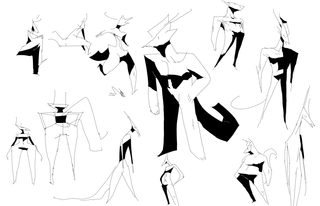
The shape of your average LADY (and boy)

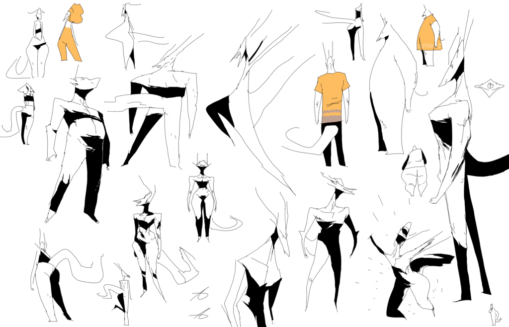
some more body shape doodles. just seeing what works and what doesn’t for the story.

trying to design the clothes hand in hand with body shapes, which i haven’t done as much in the past as i probably should. the clothes and silhouette are basically the characters’ “brand”, i think it helps for them to build off each other. it makes the impact more distinct at least.

panel borders always kick my butt. it’s still easier for me to draw characters without worrying about panels even after all this time. a lot of times i like how a character silhouette looks in a vacuum but when it’s on the panel it clashes with other elements. oh well. still learning

At a glance

I find silhouettes and shapes just as important as detail. Silhouettes can be tough for me to integrate into the background and still make it look good. always learning.

I find a lot of these have interesting shapes which can help differentiate characters. the types of clothes a character wears is just as important as their body shape and body language, since it helps the audience recognize them. it is their ‘brand’, if you will. it also makes certain poses more or less difficult to draw. 😉

what are half of these outfits? i have no idea. the story of my life: we can take it further.

The shape of your average boy

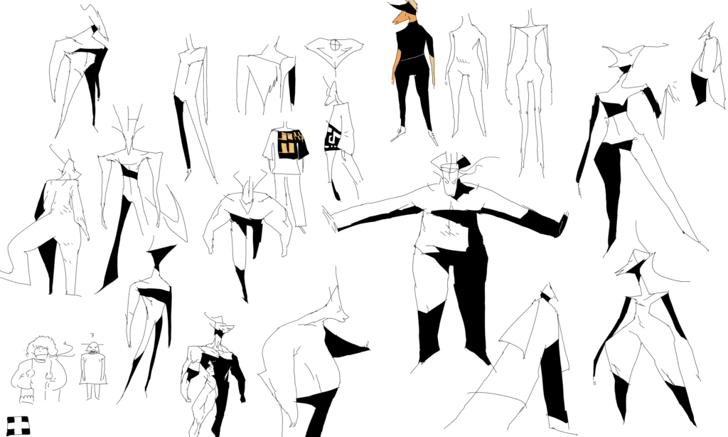
i said earlier that i was trying to be more intentional about body shapes in ch4.

there are a few reasons for this. first off, it helps differentiate the characters better. that has always been a challenge with any non-human character, and other facets like the tattoos (and of course, page-to-page context) are designed to help assist the reader in telling characters apart. i’m not really sure why i was so reserved with body exaggeration in the past, especially when i really go ham when I doodle and make some really crazy looking figures. since i value the characters’ silhouettes so much, exaggeration of the body will also be a huge boon to being able to tell who a character is just from an outline.

on a similar note, exaggerating the bodies also helps from a storytelling perspective because the shape of the character can better integrate with their personality. would a big beefy built boy be a grizzled bruiser? he sure would look it. or you could subvert expectations and make him a big teddy bear. stuff like that.

Of course, it’s not that I never thought about these factors until now, it’s just that now I have decided to be more intentional about it. which leads to the best part: it’s a lot of fun for me to play with body shapes. 🙂 and it’s always great to enjoy your work! God designed me to care about stuff like this, so I better invest in what I’ve been given.