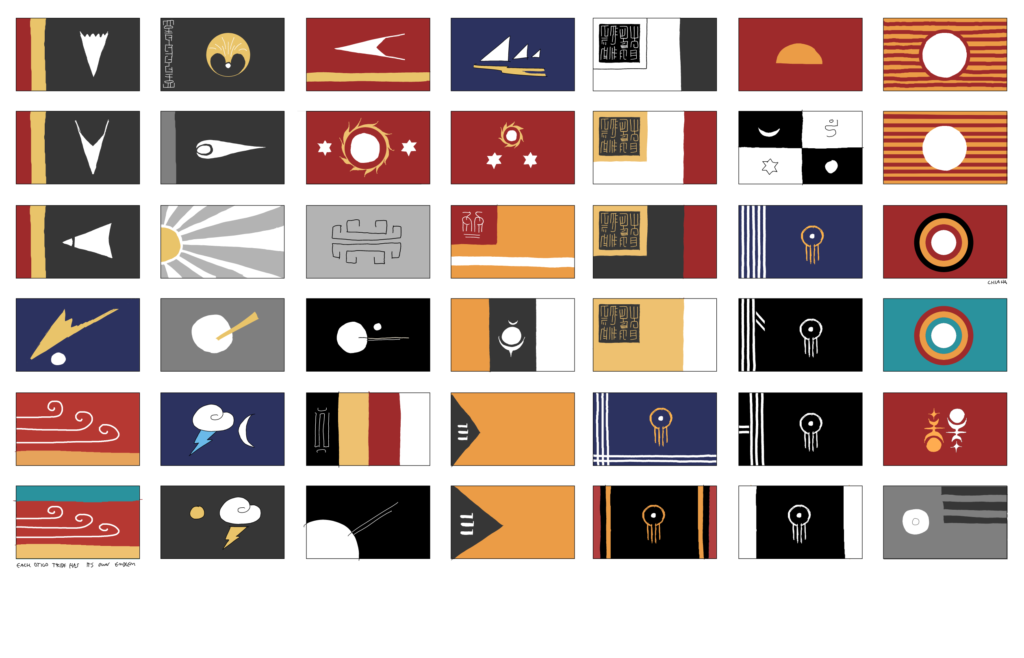
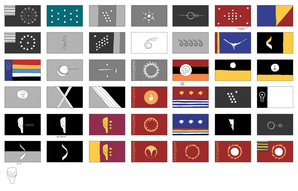
i may have a problem.
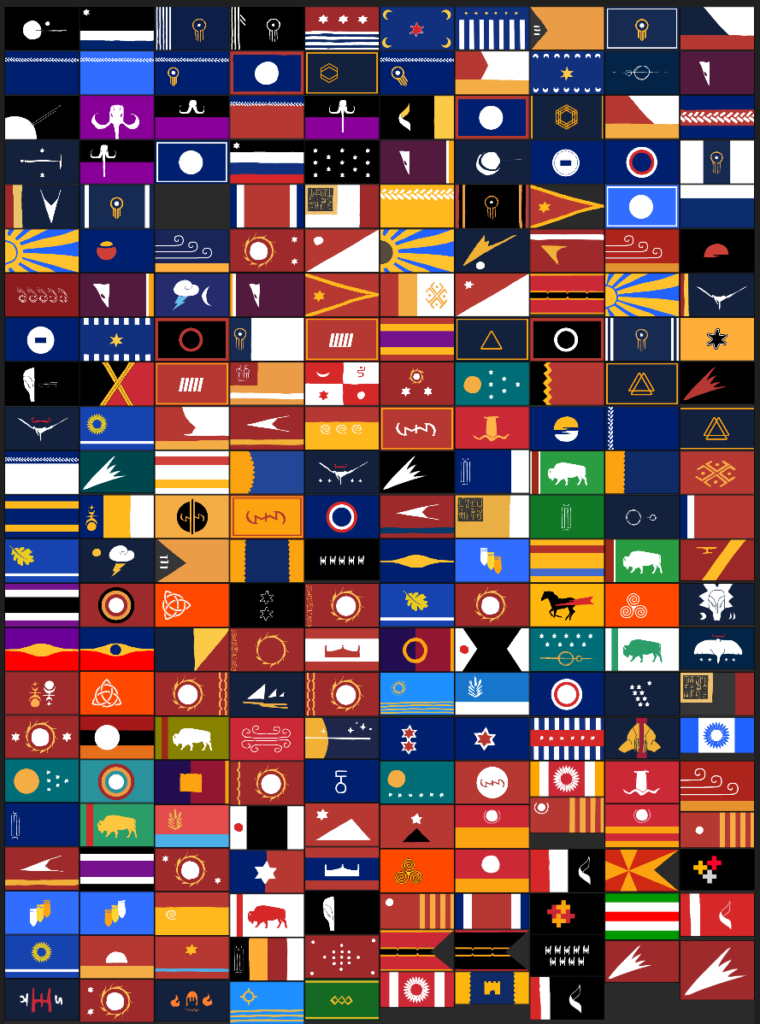
or maybe it’s only a problem if I address it??
but the might I wielded before was nothing compared to this new dark power I have discovered. behold!

it’s really interesting how many flags are designed to be off-center towards the pole (the “hoist”). it looks odd when viewed as a static image, but when you see them in motion you realize that they actually look centered since the tail of the flag moves more than the rest. try plugging in the bangladesh or french naval flags into the flag waver link above to see what I mean. there are a lot of design considerations like this to factor in that may not be obvious.


I think that’s a big reason why I appreciate flags so much. They are such a good case study of “practical art”, art that exists to communicate a message as quickly, efficiently, and stylistically as possible. a clear advantage of graphic design/art over other communication mediums is how concise it can be. and I also appreciate them for their historical and societal connotations. they are symbols, and symbols are powerful. they are neat, and I appreciate the minutia of the design of good flags. there are a lot of factors that make a good flag good which post people don’t even realize.

