
like the last post about flags, a lot of these are ripoffs of real-life flags. also like last time, it helps to weed out generic ideas in favor of something that hopefully will have more legs. just playing around as always.
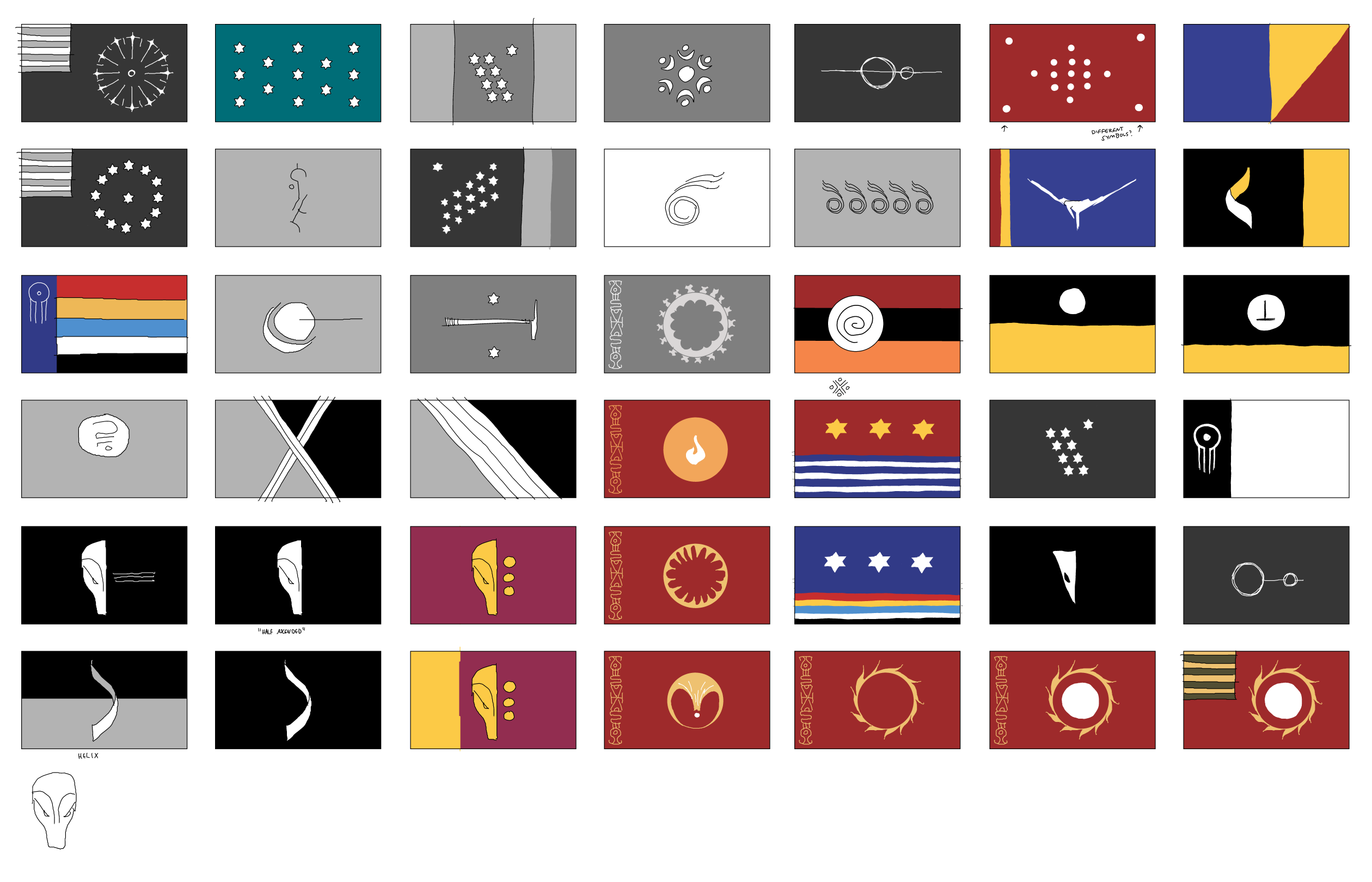
the goal of a lot of these is to make something distinct but still have competent flag design. it can be pretty hard to make a design that is simple and distinct. it can be hard to keep it from getting too cluttered or busy. i see why many flag designs have (what i feel are) too many elements. it can be pretty tempting. but it is also for good reason that most real-world flags air on the side of minimalism, even the incredibly old ones. keep in mind that you also need to recognize a flag at any size, what if you are on the border of enemy territory and see a flag in the far distance. It is only a millimeter in size relative to you. I hope you will be able to tell if it belongs to friend or foe.
also for these flags in particular it’s important to keep in mind how these look in B&W. pretty useless to come up with some crazy colorful pattern when the comic is monochrome. it’s not really that big of a deal, because I believe that the pattern of a flag is much more important than the colors anyway. it’s like its silhouette.