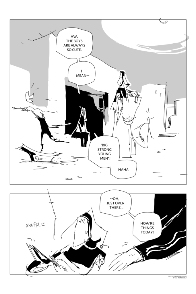
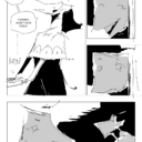
#671. pg 665
Jul 08, 2025
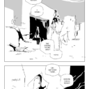
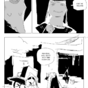
#670. pg 664
Jun 20, 2025
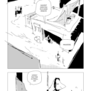
#669. pg 663
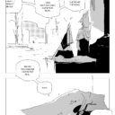
#668. pg 662
Jun 18, 2025
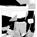
#667. pg 661
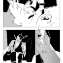
#666. pg 660
Jun 13, 2025
#665. pg 659
#664. pg 658
#663. pg 657
Jun 06, 2025
#662. pg 656


 1 - People of the Wind